Marking the papers used to be the hard part, so the analysis never happened. You wrote the totals in a register, read out the top three, and moved on to the next chapter.
When the marking takes four seconds a sheet, the register is the slow step. Everything below is worked out for you the moment the last sheet is scanned — rank order, the spread of the class, and the questions that quietly went wrong for everybody.
Where the numbers live
On the exam page, under the answer key, is Score sheets, analytics & reports. It opens on two tabs: Students, which is the rank list, and Class analysis, which is everything else.
The rank list
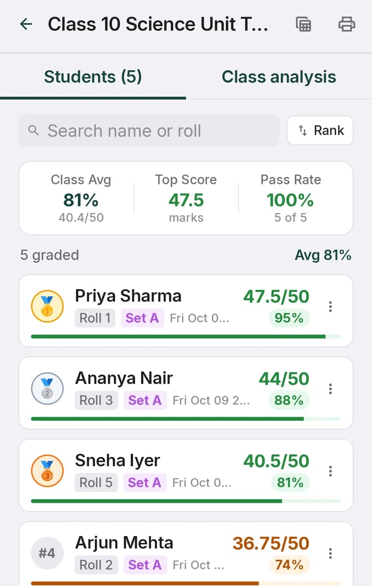
Three figures sit above the list — class average, top score and pass rate — and then every student in order, with marks, percentage, the set they sat and when the sheet was read. You can search by name or roll, or re-sort by roll number instead of rank when you are copying marks into a school system that expects that order.
Average, median and the spread
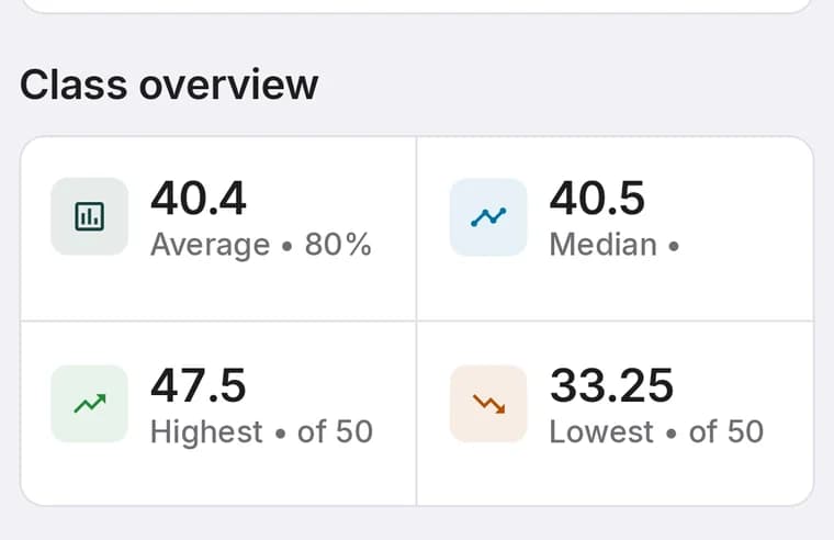
The average on its own is a thin thing to plan a lesson from. Next to it ScanScore puts the median, the highest and the lowest, and the gap between those tells you what kind of class you are looking at:
- Average and median close together — a normal spread. The average means what you think it means.
- Median well above the average — most of the class did fine and a handful did very badly. Those few students need help; the class does not need re-teaching.
- Median well below the average — a few strong students are carrying the figure. The chapter needs going over again.
- Highest and lowest far apart — the class has split into two groups, and one lesson will not serve both.
Item analysis
This is the part worth the scanning on its own. ScanScore counts, for every question, how many students got it wrong, and lists the worst offenders.
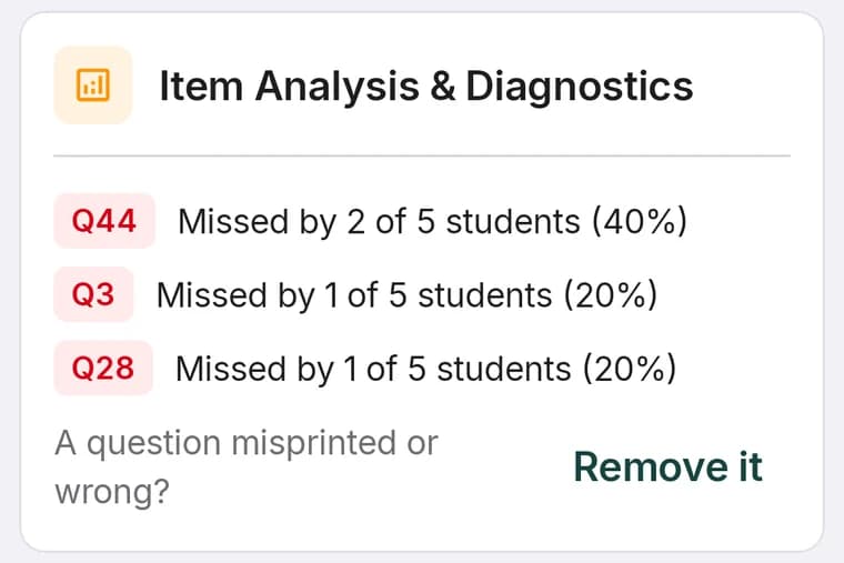
A question most of the class missed is one of three things, and they need different responses:
For the chapter-level version of the same picture, tag the paper into sections and read the per-section percentages — see subject-wise result analysis. Sections tell you which topic; item analysis tells you which question inside it.
Acting on a bad question
Under the item analysis is the line A question misprinted or wrong? with Remove it beside it. Removing a question leaves it printed on the sheets the students already have but stops it counting, and you choose where its marks go: to every student, shared equally across the rest, or shared in proportion. Every scanned sheet is re-marked.
That full flow, including what to do in a multi-set exam where the question has a different number in every set, is in the answer key guide.
CSV and printed result sheets
Two icons sit in the top bar of the results screen. One exports a CSV — names, roll numbers, marks, percentages — that opens in Excel or Google Sheets, which is what you want when the school keeps its own records. The other prints a result sheet you can put on a noticeboard or send to a class group.
Individual students get their own version too: open a student from the class and Progress Report & Analytics builds a report with their history, averages and attendance, with control over what it includes.
The habit that makes it pay: before handing back the papers, spend two minutes on the Class analysis tab. You will walk into the next lesson knowing which chapter to open and which question to apologise for.